
1
Overview
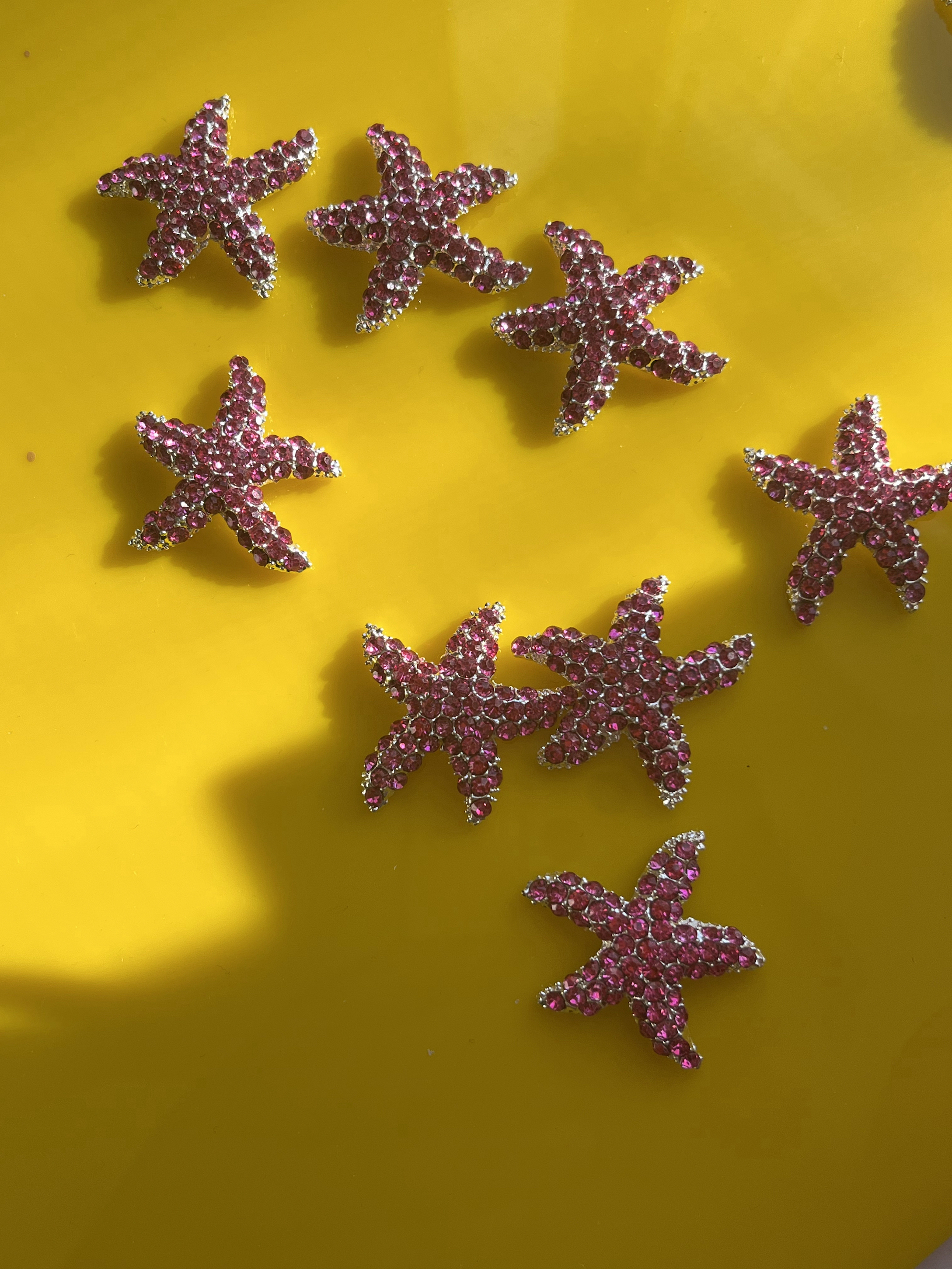
Serendipitous Project is a demi-fine jewelry company specializing in creating made-to-order jewelry. While they have a solid customer base, they are having trouble attracting new customers and are looking for a solution to help convert new and curious shoppers across their platform.

2
Problem
Although online shopping makes it possible to purchase clothes with just a click of a button, it does entail numerous problems. It can be overwhelming to sort through a vast amount of products. In addition, users are hesitant to buy products with a higher price point online since they cannot fully assess the fit and quality of the product and are concerned about fraudulent websites. Therefore, the challenge was to create an experience for shoppers that would help them sort through products more effectively and make them confident in buying from a DTC independent brand online.

3
Iterate
Version 1.0
Version 2.0
I led the redesign of our brand's website based on feedback gathered from user interviews and usability testing. During our research, we discovered that users appreciated when jewelry sites had curated collections that made it easier for them to find products that fit their style and preferences.To incorporate this insight into our design strategy, I created a designated sub-menu for curated collections on the main navigation menu. This allows users to quickly sort through products based on their shopping preferences and adds a personalized touch to their shopping experience. It was crucial to improve our information architecture and key features to enhance user experience before the website re-launch. Therefore, we optimized the main navigation menu to allow users to browse through products more efficiently. Since the brand's product library is not extensive or complex, we decided to house all products on a single page and utilize product filtration to create a faster and more streamlined user flow. This redesign approach was based on the insight that users preferred to sort through products by characteristics such as color, materials, product type etc.
%20(1).png)
Version 1.0
.png)
Version 2.0
Version 1.0
Version 2.0
4
Solution
Based on our research we developed an UX strategy focused on creating an in-store experience for online customers by building a website that acts as an employee of the company. We recognized that users need access to helpful information, curated collections/suggestions, and efficient user flows to have a smooth shopping experience. Therefore, we designed the website to deliver all of these features and improve the user experience.To incentivize customers to convert, we created multiple touch points throughout the website. We integrated CRM technology into the website to help us reach customers even after they leave the website. This allows us to communicate with customers in a personalized and meaningful way, increasing their engagement and likelihood to convert.
.png)
Responsive Website
Product Filters
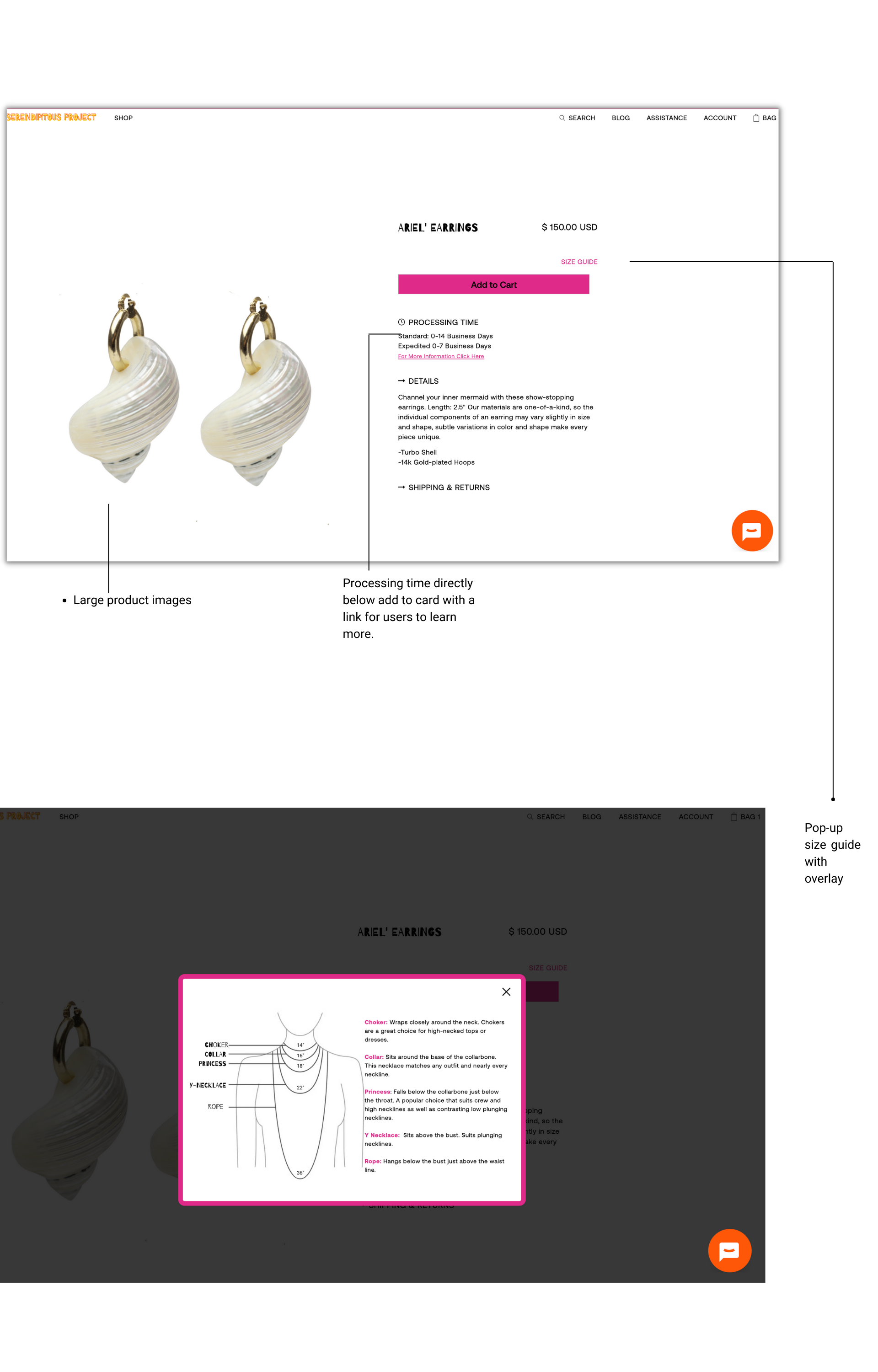
Size Guide
Shop Our Instagram
Shop Our Instagram
5
Outcome
What’s a Rich Text element?

